
Spark New Zealand
Design System – Spark Experience Toolkit
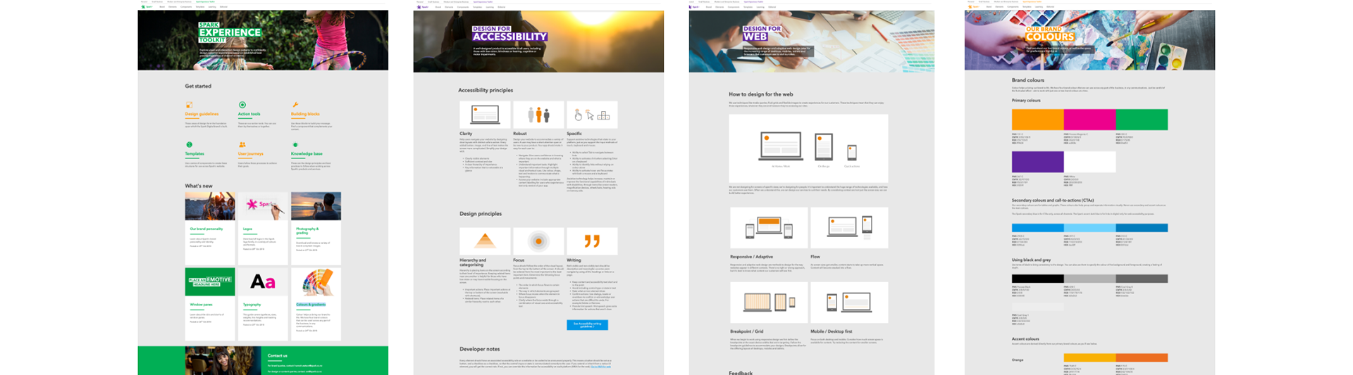
The Spark Experience Toolkit website is where Spark New Zealand’s design system live. It contains reusable patterns, assets and guidelines. The benefits of the Spark Experience Toolkit is that it brings consistency in our design, reduces effort and reduces the cost for the company.
I was involved in Spark’s design team, which help designed the foundation and built the Spark Experience Toolkit website. It is a living and breathing toolkit that Spark’s designers updates and maintains.
Problems we're trying to solve
• Duplicating effort in designing and developing components
• Difficult to maintain websites and applications
• Inconsistency in our designs and development
• Difficult to maintain websites and applications
• Inconsistency in our designs and development

Key tasks
1. Research
2. Colour palette
3. Typography
4. Icons
5. Ideation, sketches and wireframes
6. Components
7. Spark Experience Toolkit website
2. Colour palette
3. Typography
4. Icons
5. Ideation, sketches and wireframes
6. Components
7. Spark Experience Toolkit website

Research
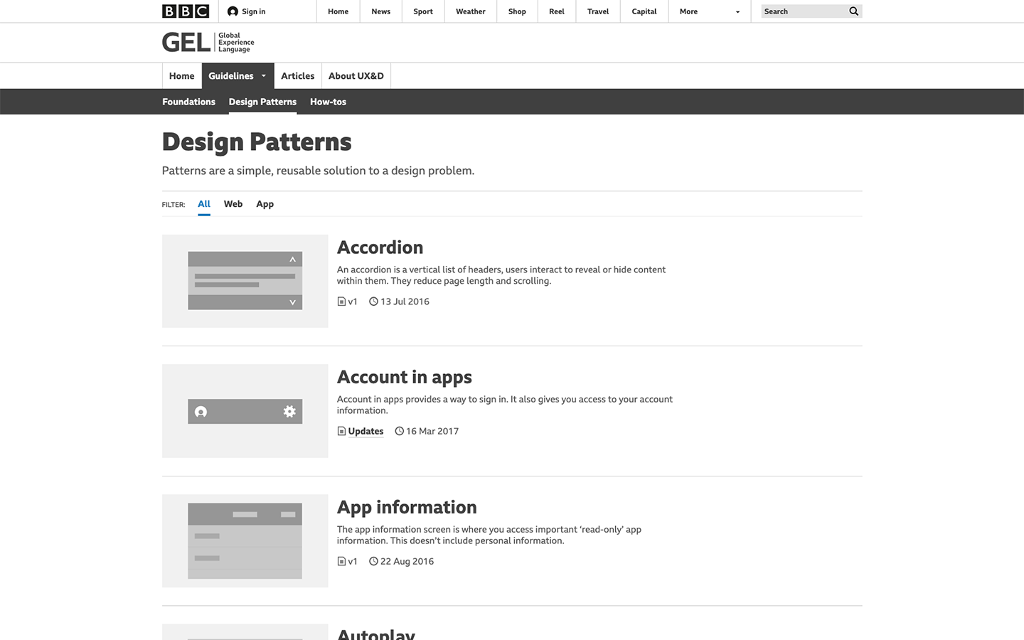
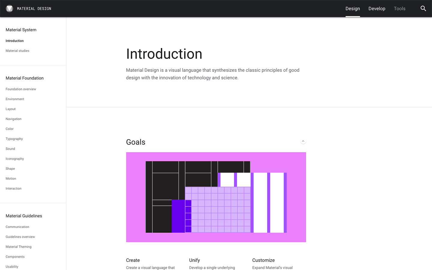
Our design team researched and studied design system and pattern library websites, including BBC GEL, Apple Human Interface Guideline and Google Material Design.
We found their websites included principles, brand style guide, assets, components, roles and responsibilities and company values, which we added to our Spark Experience Toolkit.
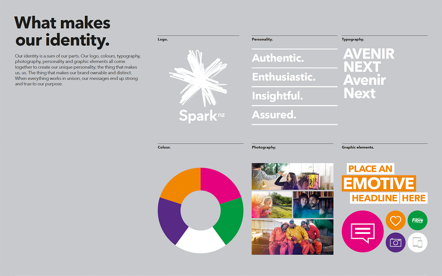
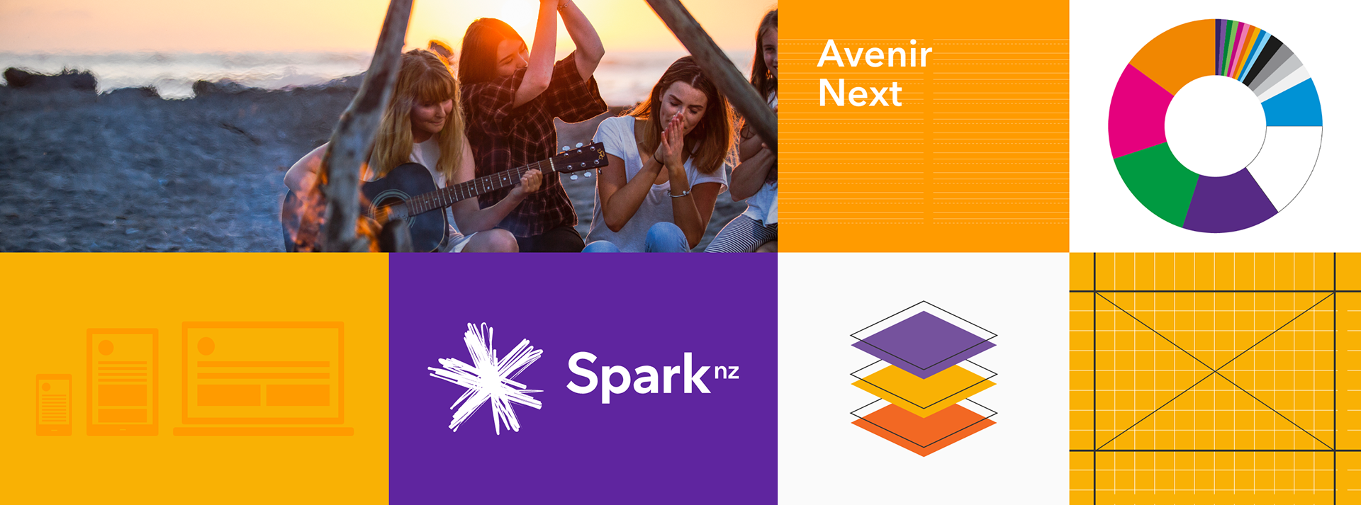
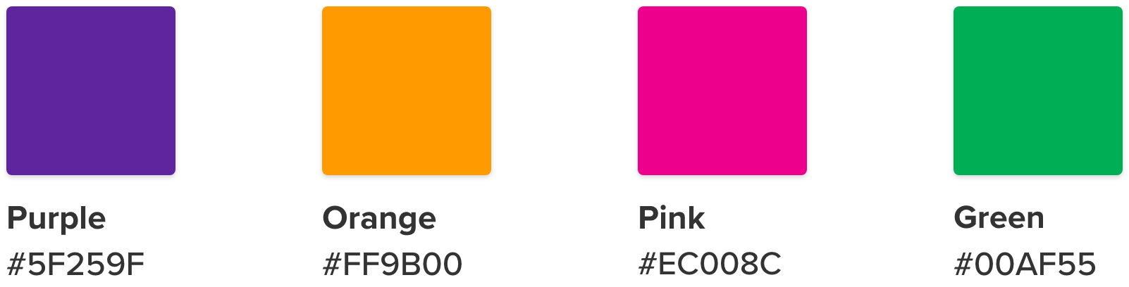
Colour palette
Colour helps us bring our brand to life. Spark New Zealand have four brand colours that can be used across any part of the business, in any communications. Aim to work with just one or two brand colours per communications.
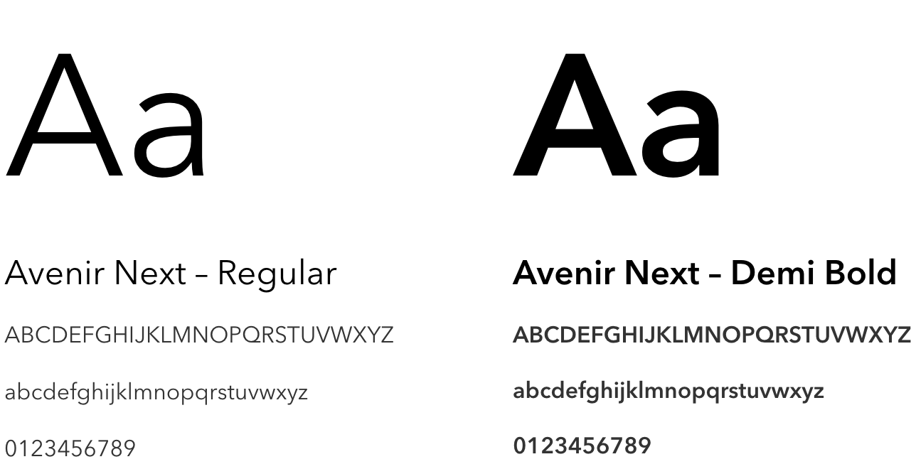
Typography
Our typeface is Avenir Next. We use the Bold, Demi, Medium and Regular variants. Avenir Next is clear and confident in all of its weightings.
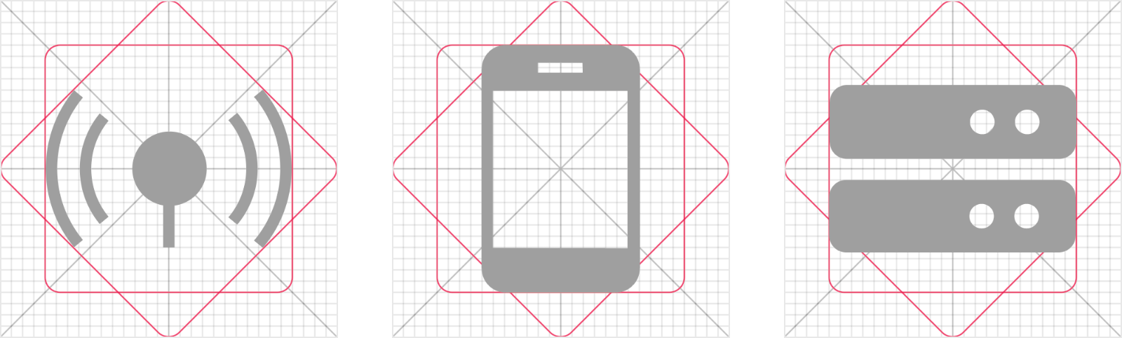
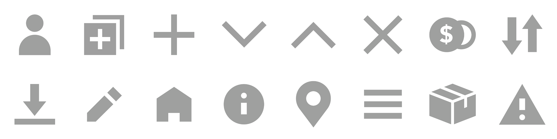
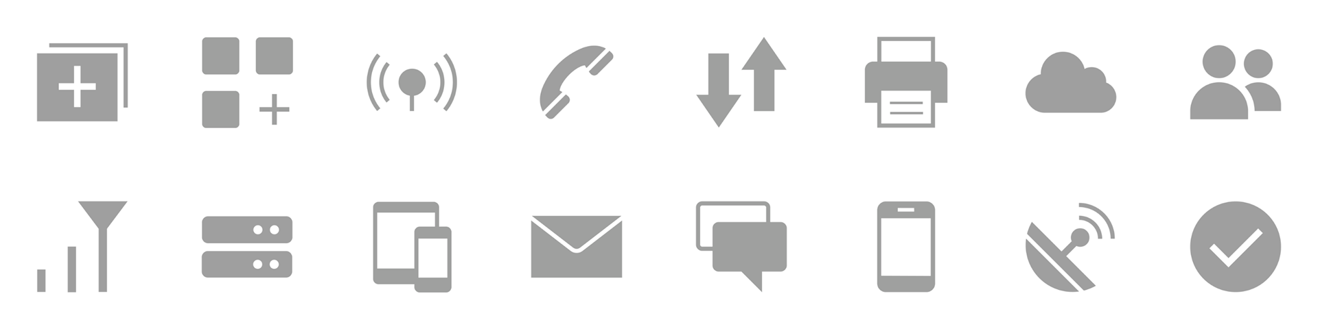
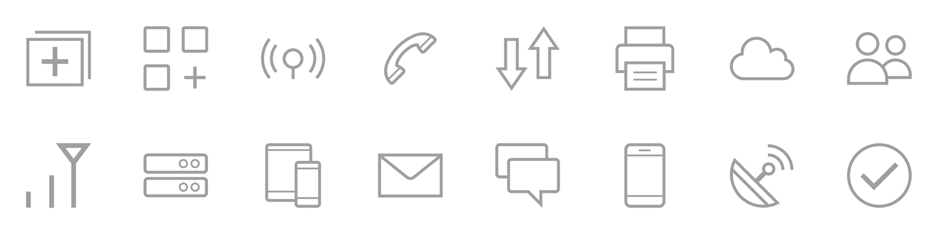
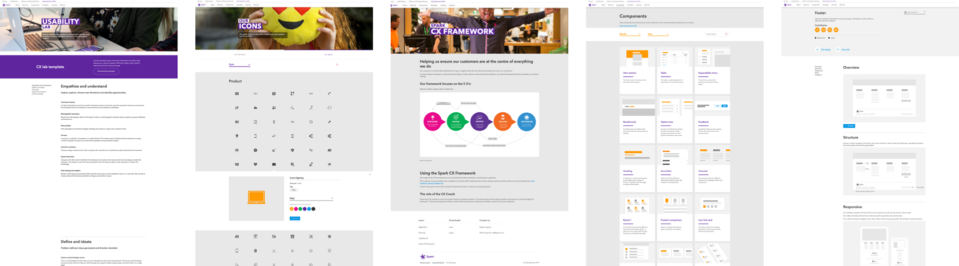
Icons
We use a grid to design our Spark icons. Our icon family includes functional icons, solid icons and linear icons.
Functional icons
Solid icons
Linear icons
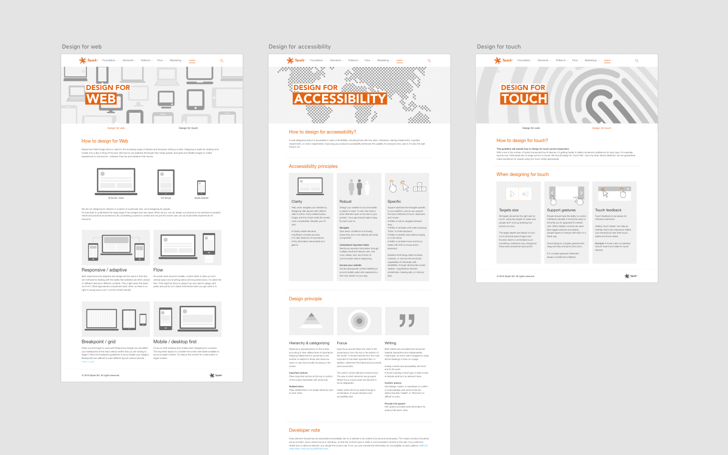
Ideation, sketches and wireframes
Collaborating with the design team, we sketched and thought of ideas to define how Spark’s toolkit would look. Using style and brand that represents Spark New Zealand.
I was involved in designing the wireframes for the component, personas, designing for web, designing for accessibility and designing for touch pages using Adobe XD.
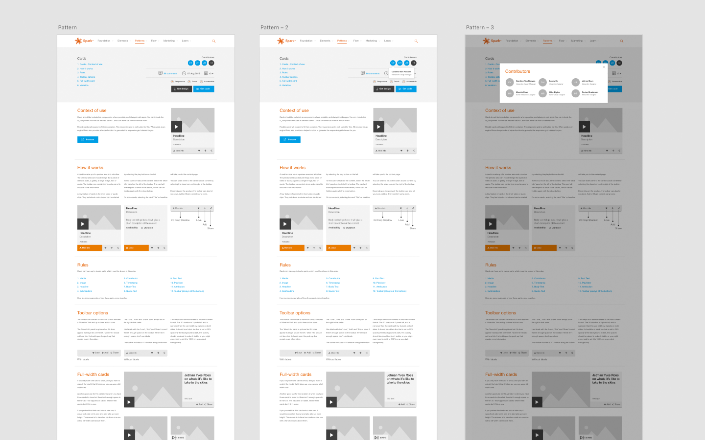
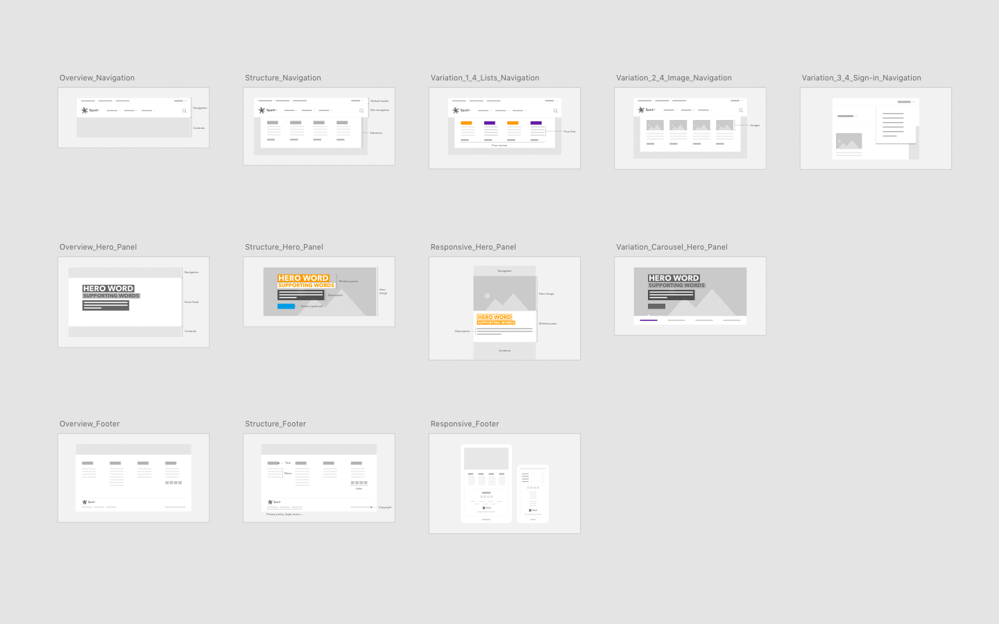
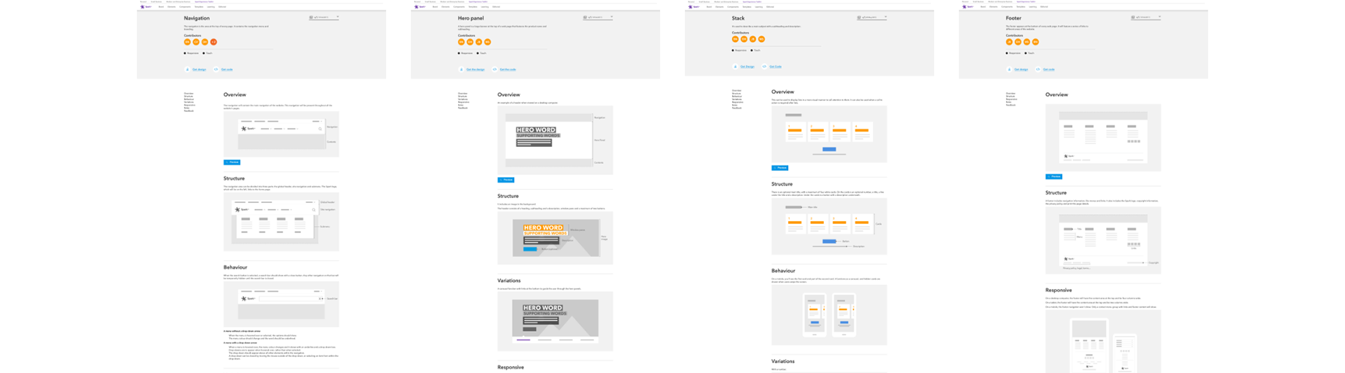
Components
We should design components that can be shared and reused.
Designing reusable components will reduce time and effort for the developers and will be easier to maintain.
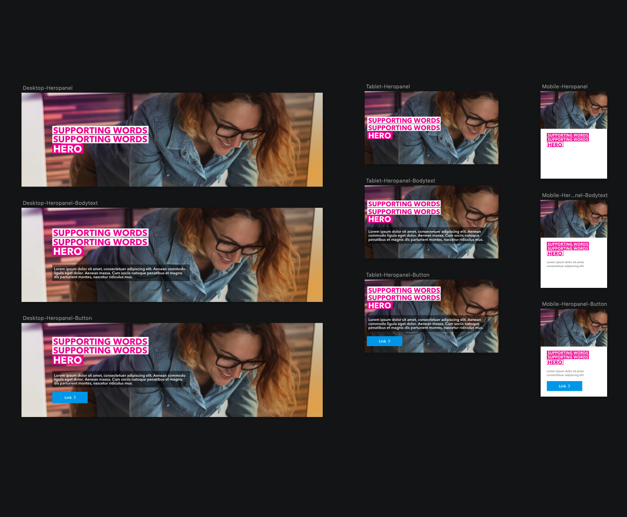
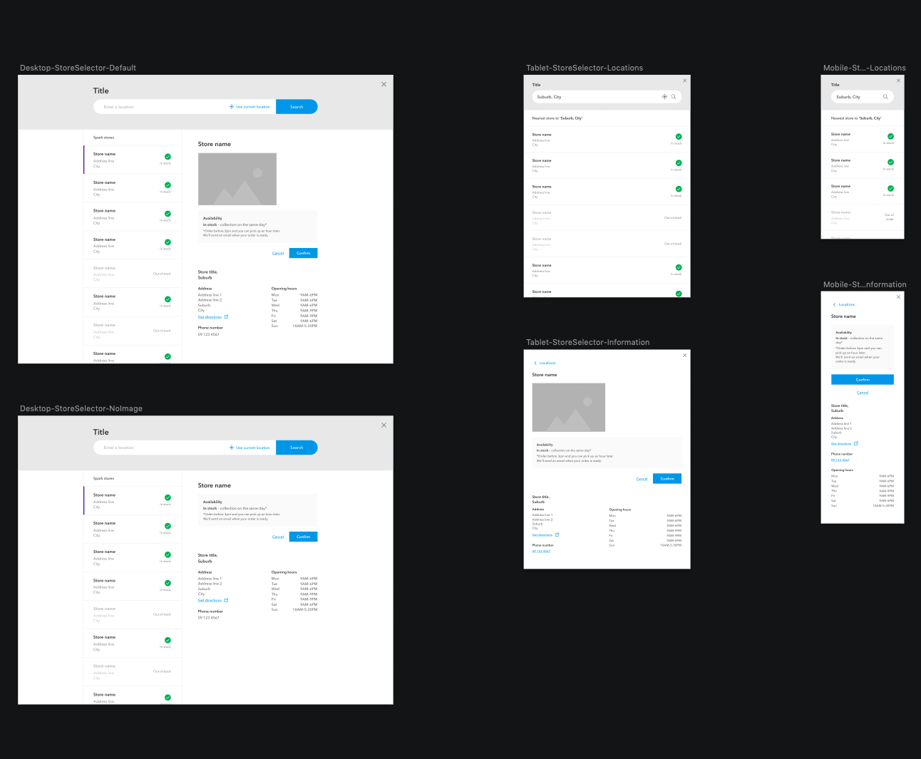
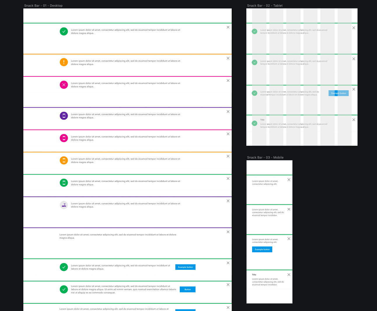
Spark Experience Toolkit website
Spark Experience Toolkit is built with Adobe Experience Manager, and it is a living and breathing toolkit which Spark’s designers update and maintain.
Not only is it the go-to place to find reusable patterns, icons, button styles and components such as Hero panels and the Snack bars. It’s a place to find style guides, principles, values, and how we design for Spark New Zealand.

Spark New Zealand – January 2017
Design System – Spark Experience Toolkit
Design system using Adobe Experience Manager content management system